Thursday 2 March 2017

Evaluation (Question 1) In what ways does your media product use, develop or challenge forms and conventions of real media products?


What went well:
Front Cover

The first thing that went well was making the effects fit in with the colour scheme. The second thing that went well was creating a star image by using the levels tool on Adobe Elements 11. Using Levels allowed me to create the perfect light for my images to look good.


Contents
In general my Contents page went really well. The best bits were adding the puffs and trying different fonts out.


DPS

It took me a while but when I learnt how to text wrap that went really well and I created a nice look. Also, aligning the images was at first, challenging, but by using the grid I learned to place them acurately and now all the pages look balanced with evenly spaced images. I also challenged conventions here as she isn't looking into camera. This was very successful as it will be a great attraction to my audience because she looks relaxed and therefore gives a good impression about Jazz and her star image. If I did this again I wouldn't change the image because I like the way it captures her personality.


What didn't go so well:


Front Cover
My initial image didn't go the way I planned. I spent a lot of time trying to cut out the image to change the background.  This led to me inadvertantly resetting a tool and in the end, had to replace the image and reset Adobe elements tools.  Whatever I had reset, also affected my being able to save the front cover but deleting the affected image fixed that problem too.


Contents
After I had learned to align columns and images, thehe only thing that I found time consuming was trying to find the right font style for jazz and then deciding what size (point) to use.  Filling the contents page was unexpectedly tricky, shuffling text and images took along time but I am quite happy with the results.


DPS

We were using Adobe Elements to construct the pages and it does not text wrap like a progam such as InDesign so it took more time than I thought it would to wrap the text.  Every time I moved or resized a text box, the wrapping had to be adjusted - but it got there in the end!


Conventions


Hover your mouse over the pages to see conventions.


Tuesday 7 February 2017

Evaluation (Question 2) How does your media product represent particular social groups?


What went well:


Upon reflection, I made my magazine suit the target audience (TA)  because it features young artists and vibrant colours. Also I have kept a lot of the stereotypes of Jazz because it is seen as a genre for upper class people and I wanted to dispel that myth.  I thought about what kind of magazine I would want and decided it needed to cater for not only people starting out in music but more accomplished and aspiring musicians and music lovers.  I am hoping my TA can relate to this magazine better than older, existing magazines on the market.  Current jazz magazines are definitely aimed at an older or middle aged audience. 


I have done this well by keeping the magazine suitable for my TA, appealing to those who are young and want to become professional musicans. I liked how I created a female based magazine as Jazz is really male orientated. I achieved this by using a lot of purple in my colour scheme and the fonts are quite fancy. The stereotypical handwriting fonts are conventionally associated with women. On the other hand, creating a magazine for mostly women narrows my TA as not many men are going to read this. This could be seen as part of Mulvey's Male Gaze theory. Most likely boys will want to read this as there are attractive women in it.


What didn't go well:


As a result of keeping the Jazz stereotype I didn't create the effect I want. I wanted it to come across as everyone can take part even if they are from a working class background. Also I wanted my magazine to be gender neutral and instead I shoud have adhered to the the Gold, White and, Siver colour scheme I origianly planned. In addition I could have used more male models. As I have gone on to analyse my magazine, I have realised I have created a magazine that puts women into the sterotypical catagory of the 50's. Something which I was not going for at all.  If I did this again, I would make sure future issues were more gender neutral.

Friday 27 January 2017

Evaluation (Question 4) Who would be the audience for your media product?


Kenza Hardy's Slidely by Slidely Slideshow
Evaluating my TA - Theory
1. Aspirers
My magazine is designed for aspirers (Young people who want to get into, and succeed in music, specifically jazz.)  because lots of young musicians in the same situation as my featured artists will look up to them as a mentor and role model and aspire to be like them. I have created this in my magazine by using a feature artist with a non musical background and using instruments typically featured in the jazz world.  This also gives musicians a sense of diversion because they can escape from everyday problems and routine. I have included articles (see cut aways below) which target the people who want to get started and my main article features someone they can relate to and be inspired.

2. Succeeders
I consider 'succeeders' to be people who can already play and are looking to branch out into a different type of music.  This group of people will be interested in my magazine as they may have already made it as a musician in the classical world and are looking to broaden their skills further which Jazz will help them to do. Being a musician allows you to build a personal relationship with other musicians around you.  I have addressed these people with the article of an established player (see cut away below).


3. Being Individual


My Jazz magazine is good for the individual because as a musician you're always trying to stand out. Due to me using artists who are individually successful this will inspire them too stand out above everyone else and go against what society wants them to do. This also includes personal identity. Jazz allows musicians to create their own identity and go out of their comfort zones. It also can help with educational purposes as the individual can go on various summer schools and workshops.  At the start of planning and construction, I never envisioned my magazine for this group. However, as time went on I could see that a theme was occuring.  Below, the articles that address this group are my main article and again, Ryan.


Fun-Attics and Dynamic Duo's

Music is hard work and those who reach to top do loads of practice so this is to show it is fun and social too.  By using/including young artists and events in my magazine, it appeals to aspirational, fun seeking young adults. Music is suposed to be fun and a good way of relaxation. For Dynamic Duo's I have included a "Get Involved Section" I have included this so that couples can join the same band and have some quality time together while doing something they love. (Cut aways show the articles in my magazine I think reach this audience.)
Conclusion


To conclude I met my intended target audience by keeing my magazine young with young artists and also young musican getting somewhere in life. People of the age 17- 21 like to have something to motivate them and inspire them to do something big with there lifes. It also caters for the 21-25 years old because if you are a musican in an orchestra, with the right instruments you can broaden your skills. This is different from my intended audience because my intended audience was 17-21 year olds instead of 25 year olds. I have used vibrant colours which also caters for young people.

Saturday 21 January 2017

Evaluation (Question 6) What have you learnt about technologies from the process of constructing this product?

Throughout the process of completing my coursework, I used various media technologies to complete such exercises. As part of the course I had to use an Apple Mac computer. I had never used one of these before so I had to learn basic skills like turning it on, using the internet and learning to screen grab. By using the iMac, I also learnt how to find work on it, eject a memory stick and where everthing was stored like screen shots.


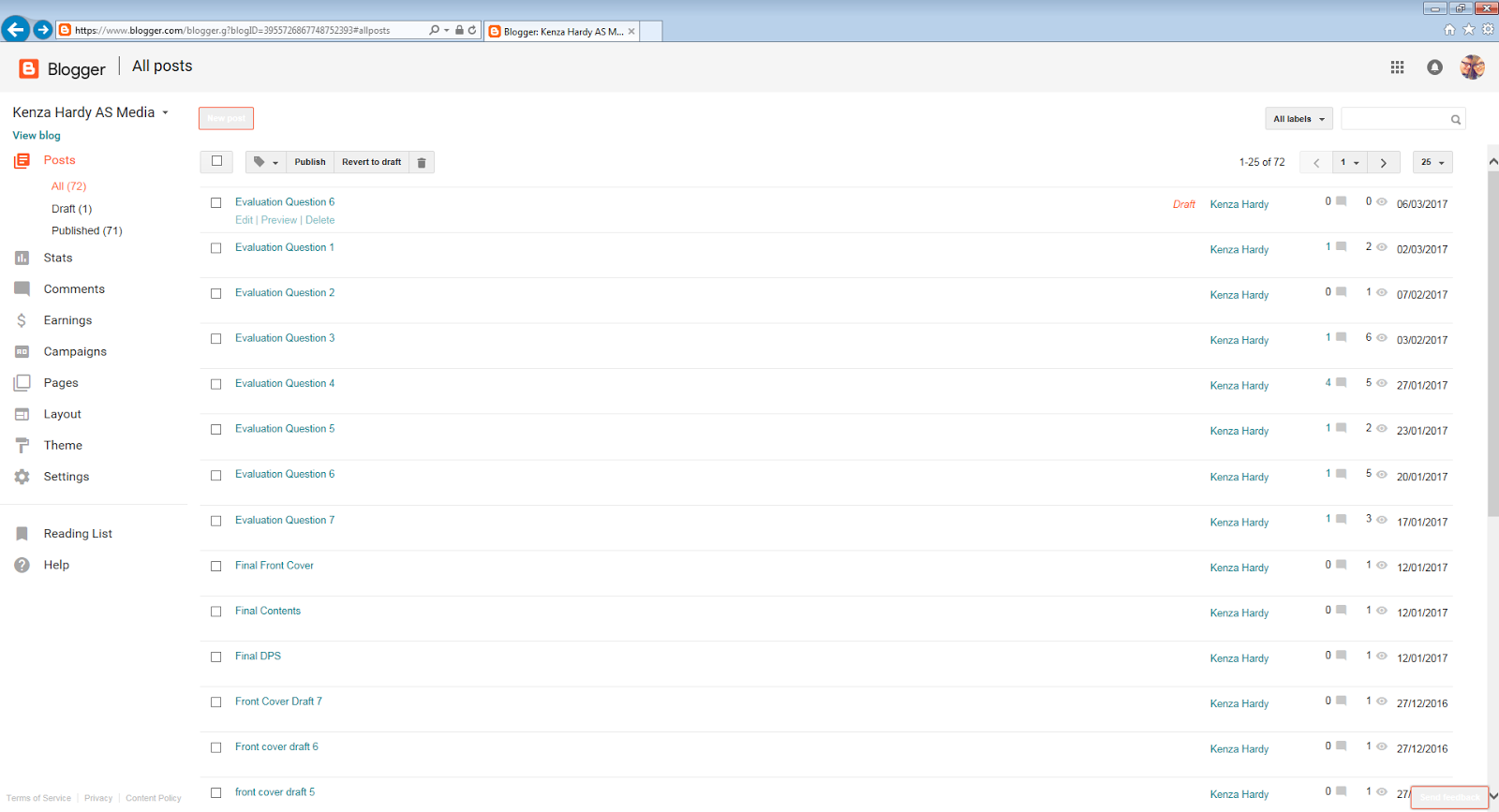
  After learning the basics of the iMac, I learnt how to use Blogger. This was the software I was going to use to record my coursework progress. I first set up an account for my AS Media Blog and explored the site. I discovered how to create a new post and how to publish it, how to add images and work my way around the different tools and also how to embed presentations like Prezi's and Powerpoint's, via Slideshare. I think Blogger is great because it has allowed me to keep all of my work tidy and organised. I have done this by titling my posts and it automatically kept everything in date order.


To show some of the entries in my blog.  Below is one of my embedded presentations, this one via emaze.


To record my research and planning, I used a variety of different media sites to present my coursework. For example Thinglink, Slidely, Emaze, Prezi, Powerpoint and Slideshare. My favourite ones to use were Thinglink and Emaze. I enjoyed using Emzae because it is a fun and creative way to make presentations rather than Powerpoint and I enjoyed Thinglink because it is simple to use and it allows you to show exactly which part of the image I was talking about. It is an annotation program tthat allows you to pinpoint the source of your comment. I also really liked using Slideshare to embed Powerpoints as Powerpoint allows more creativity than emaze.


To show the emaze (above) and Thinglink (below) which I used for all my pages.


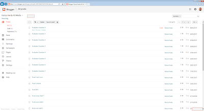
One of the technologies I used for my blog was text and screen grabs. This allowed me to go into detail on my posts without worrying about a word count and be able to show examples of my work.


To show the text and screen grab used in my blogg.


As the course progressed I used Flickr to post my music magazine pictures on.  This is a site just to showcase photos and videos and with the right personal settings, can be viewed from anyone in the world, so is quite useful for feedback.


Flickr homepage


I took my pictures with a Panasonic FZ62 camera and a SD memory card.  The pictures were then stored on my user area for easy access. I learned about different camera angles such as long shots and close ups.  I also learned that these small cameras cannot take photos in low light without additional light.  A good example of this was when we used continuous lighting to light the studio work. 


  The last thing I used was Adobe Elements 11. I used this to creare all three of my magazine pages. Some of the tools I used were layers, shapes, layer mask, healing tool, brush tool, levels tool, paint pot tool, resize, levels and saturation/hue. I found it quite hard to use to start with but the more you learn, the more intuitive it is.  I liked using layers and ordering them so all the elements of my pages were visible. I realised that while alot of these tools are fun, they are also essential for manipulating photographs for publication.  I learned that once you get really skilled in using the program, there is very little you can't do to the image and it really added to my creativity. It gave you a freedom drafting by hand on paper does not allow. 
  I also learned how to save my work and which file format's retained the layers (.psd) and which flattened them. (.jpg)


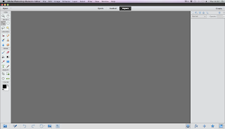
The Abode Elements interface

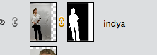
Showing how I used a layer mask to separate Indya from the background.


Above - some of the tools on Elements

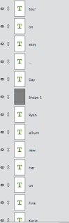
You end up with loads of layers as this screen grab of the layers pallet shows.


What didn't go well:


At first, the iMacs and I did not agree and I kept crashing it.  As I got more familiar with using it, I learned to give them time to process what I wanted them to do.
Secondly, I had problems saving to my User area so I found out I could save to a flash drive which solved the problem nicely.


What went well:


The quality of my photographs was really good. During the studio shoot, I used a Nikon D7200 which was a really good camera. Also, some of the websites we used were blocked by internal filters so these could only be used at home but there were plenty of other suitable websites the filters would allow, such as Thinglink and emaze.  I enjoyed the creativity all these different presentation methods.